Renaissance fitness Ledbury - CASE STUDY
Renaissance Fitness Ledbury transformed from a traditional, one room, personal training studio, into a modern, 24 hour, 2 story gym with 4 rooms based on Ledbury’s high street. A full rebrand was a must for them to attract new clients.
Their old logo is shown in comparison to their new modern branding, as you can see the vitruvian man was kept as it is symbolic to them but a new style badge logo was created to match their new brand values.
The gym’s whole colour scheme was updated to dark charcoal grey and a contrasting cyan blue, which conveys feelings of: strength, dependability, and tranquillity. Joining a gym can be nerve racking experience to some, therefore creating a calm environment for all was important for the owner Oliver. Previously the building was orange, red and yellow with red and grey checkered carpet, which was not easy on the eyes…
Old traditional / dated logo - before rebranding.
LOGO GUIDELINES
Always provided in logo packages to keep clients on brand at all times. Colour codes and fonts with additional complimenting colour schemes were also given to Renaissance Fitness to help them pick out the paint colours for the inside of their gym.
Alternative colour logos, text only and a simple brand mark files are also provided to be used throughout their branding.
Photo of the inside training room painted with light grey walls and cyan highlights as recommended by us.
OUTDOOR STICKERS
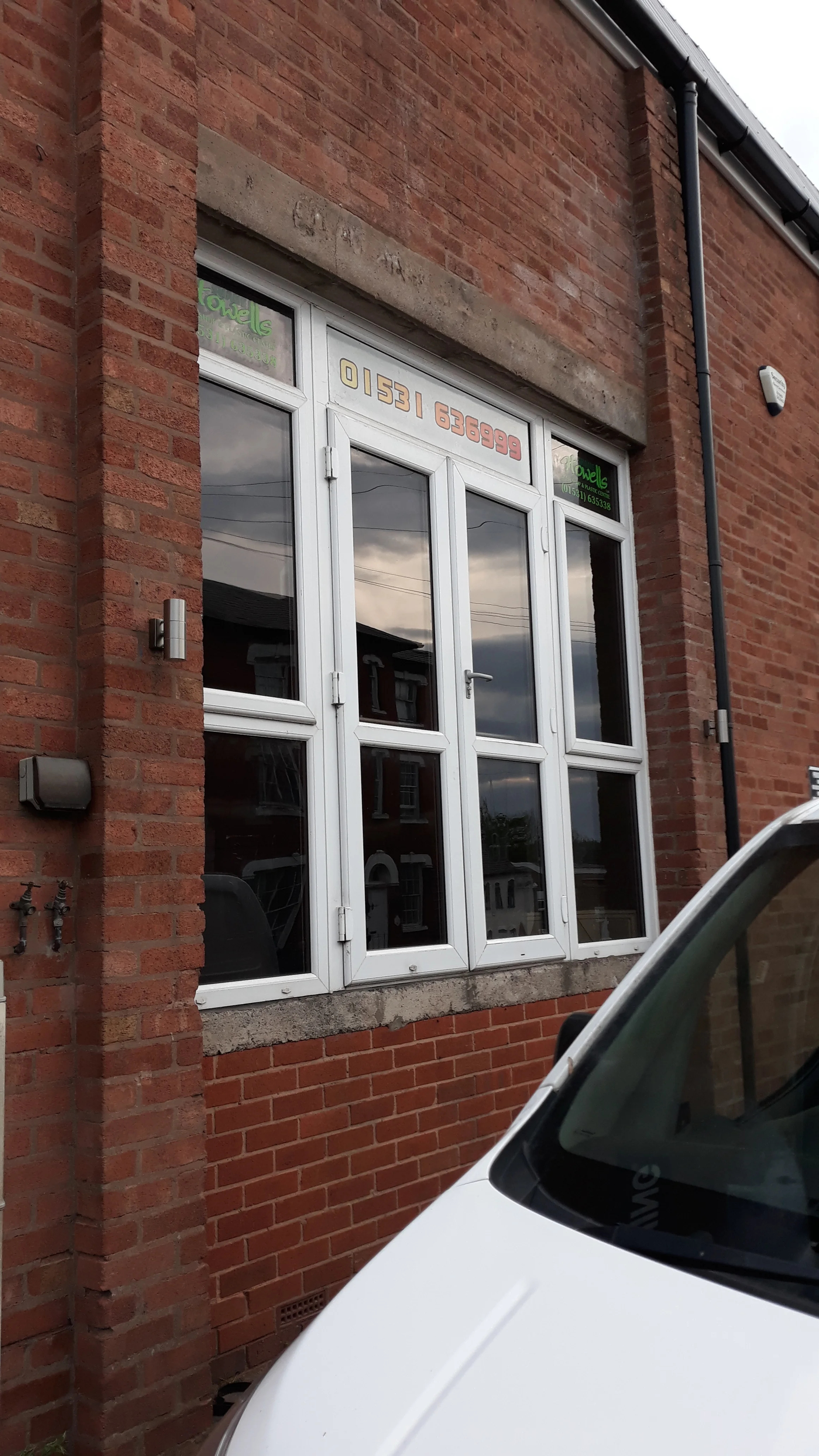
Next we designed all the outdoor signage and stickers which were applied very well by local sticker expert Peak Stickers, the last photo is how the windows looked previously. We created icons and useful information without going overboard with advertisements.
AFTER
AFTER
BEFORE
STATIONARY DESIGN
Full stationary set was created and printed for them including:
A4 Letterhead Design
85x55mm Double-sided Business Card Design
Comp Slip Design
The designs were kept clean and modern to match their new brand identity.
T-SHIRT DESIGNS
Short sleeve charcoal t-shirts were designed for staff to keep them looking the part. Printed by local business Peak Sticker.
ADVERTISING & MARKETING
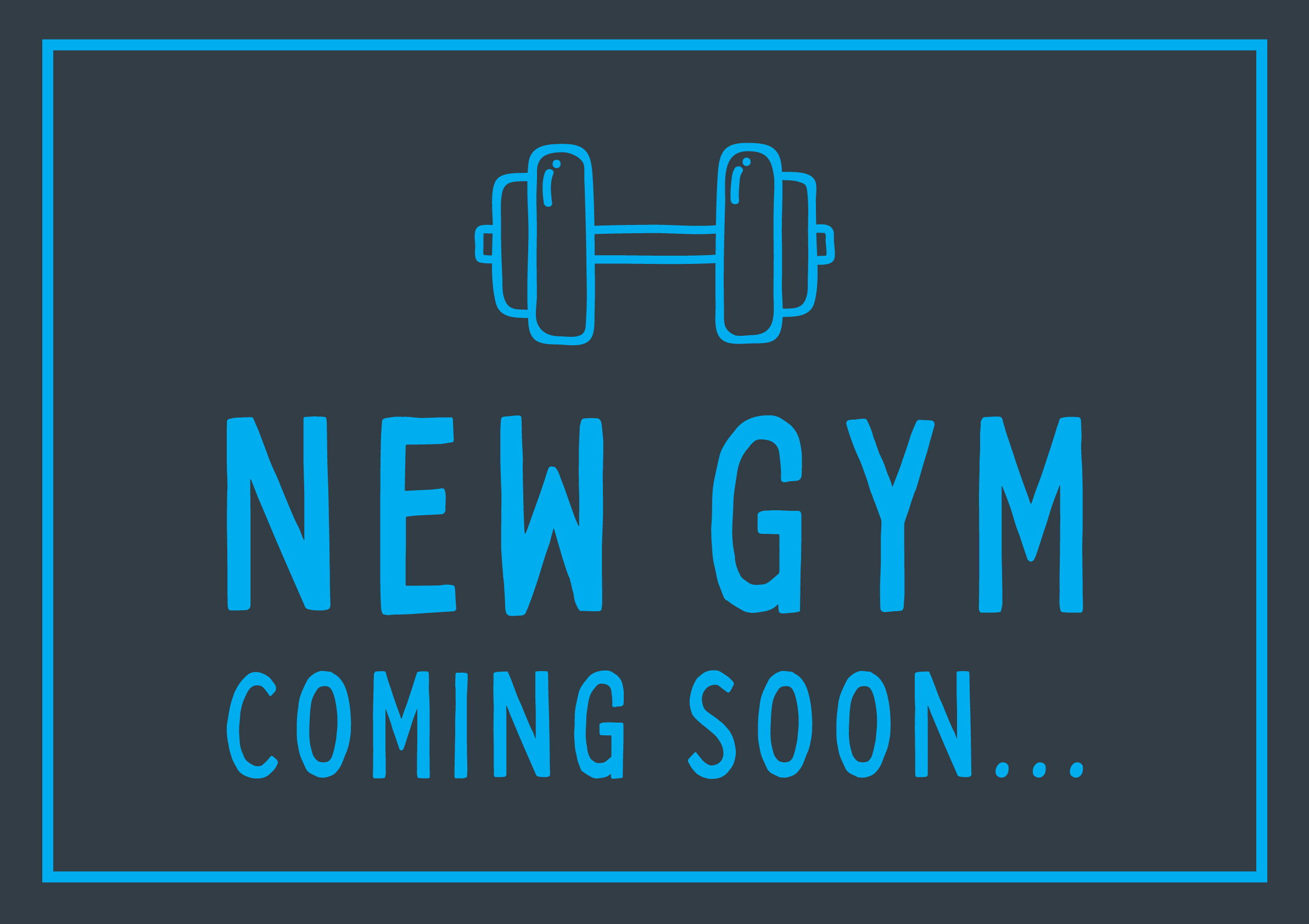
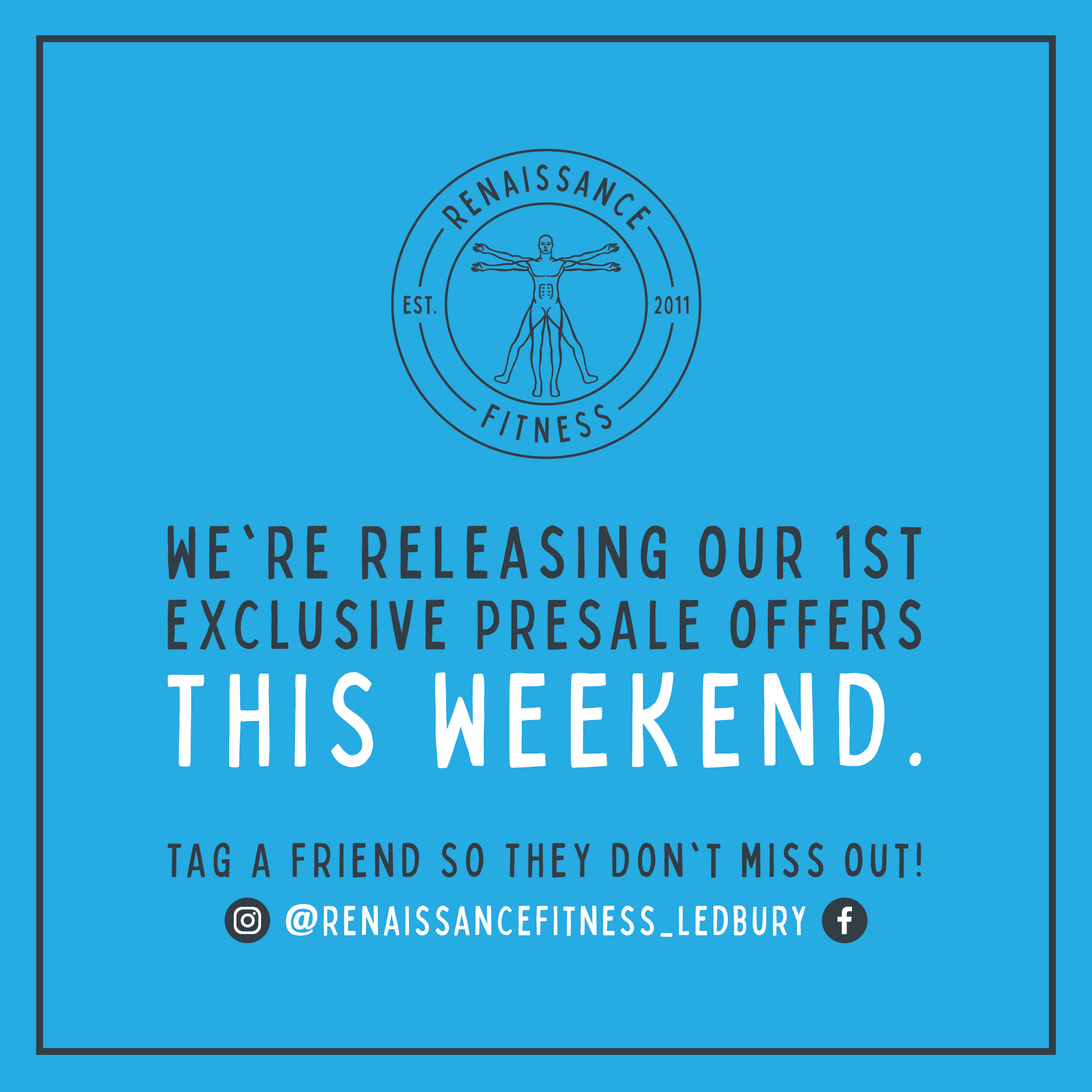
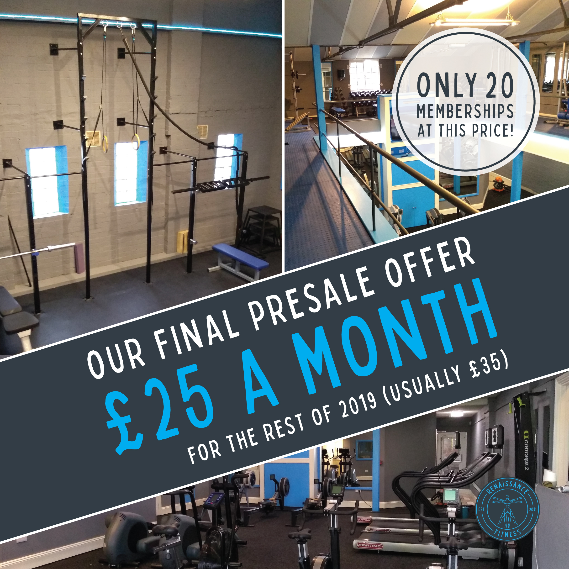
Adverts and banners were designed to use across social media to make various announcements and gain more interaction and attention before their opening day.
TRAINING LOGS
Double-sided A5 bespoke training logs were created to help Renaissance Fitness’s client keep on track and log their progress easily.
Printed on thick 350gsm paper to last throughout their personalised training plans.
If you’d like to discuss a new look for your business, get in touch by clicking the button below.
I’m happy to meet over a brew to discuss the process and any questions you may have:
